MQA Is Made For Apple
Web Analytics are very sophisticated now.
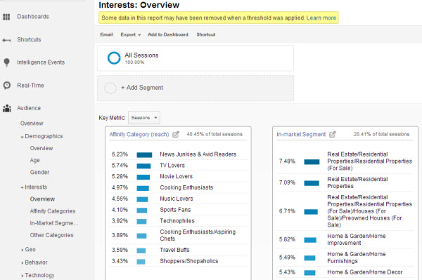
Once a website has enough traffic, trackers like Google Analytics offers very accurate demographic for any website’s readership. There are a tons of metrics, and this data allows the content creators to streamline their website to retain their readers’ attention for as long as possible.

Now if they have a profile on audiophiles who are looking for MQA music on MQA’s website, the bounce rate will be very high. Bounce rate is defined as the percentage of visitors to a particular website who navigate away from the site after viewing only one page.
As MQA is using Google Analytics - they will know this.
People these days are so used to finding information - if they cannot find the information they need in 10 seconds, they will just move to the next search result of the list.
Looking at the MQA website as it is today - the header contains no real information for audiophiles on how to download music. When you scroll down you do find out who providers MQA download, you have to use the browser BACK button to navigate back.
Long story short, if you are an audiophile and want to look for MQA download information, you’d find the MQA website very awkward to navigate.
However, if you are investor, all the links and the organisation of web portal navigation begins to make sense. MQA has successfully deliver every relevant information to an investor.
MQA do optimize their website, they are just not optimized for the audiophiles. Now what do you expect an audiophile to react when even official channels aren’t giving the relevant information?
Imagine if you are a customer trying to create an account with a bank. So you visit the bank website and try to see if you can create an account online, find a nearby branch, or even a telephone number to call. Unfortunately all you can find is how this bank make profits, basically an online prospectus. What would your reaction be?
Is MQA’s web design intentional? I honestly don’t know.