Accuphase DC-37
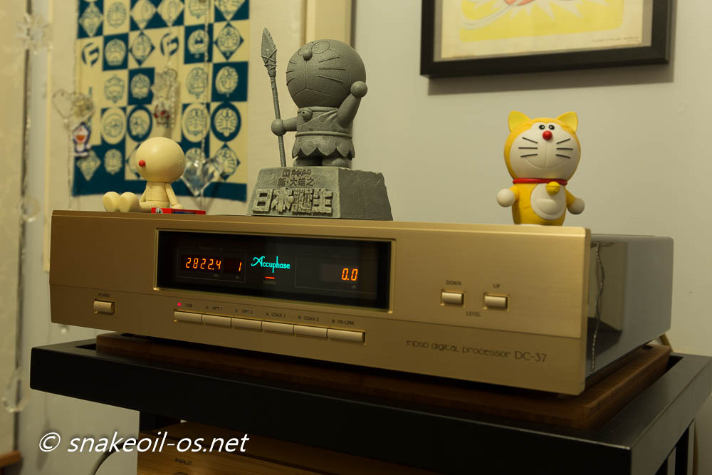
Accuphase released it's latest flagship DAC in September 2016 - the DC-950.
With the release there is now a number of Accuphase DC-37 available in the second hand market as existing owners move to the newer DAC. And I got one of them! Yeah, I cannot afford a DC-950.
This is a review of a well run in second hand Accuphase DC-37. I took ownership of this unit sometime in Sept 2016, so already have a good 3 months to get to know this.
And so far, I'm loving it! Credit goes out to Tasso for loaning me the PS3, allowing me to rip my SACDs to DSDs. Credit again goes to Tasso for selling me the DC-37 reviewed right now. No prizes for guessing what Tasso ended up with.
Look
The Accuphase design hasn't changed at all as far as I can tell. Every Accuphase equipment has that same look, that vintage/retro look you'd either love or hate.
Honestly I am not a fan of this design in the past. It takes a while for me to be convinced. In the end the simplicity in functionality ultimately won me over. Why? Because Accuphase has paid a lot of attention into the little details.
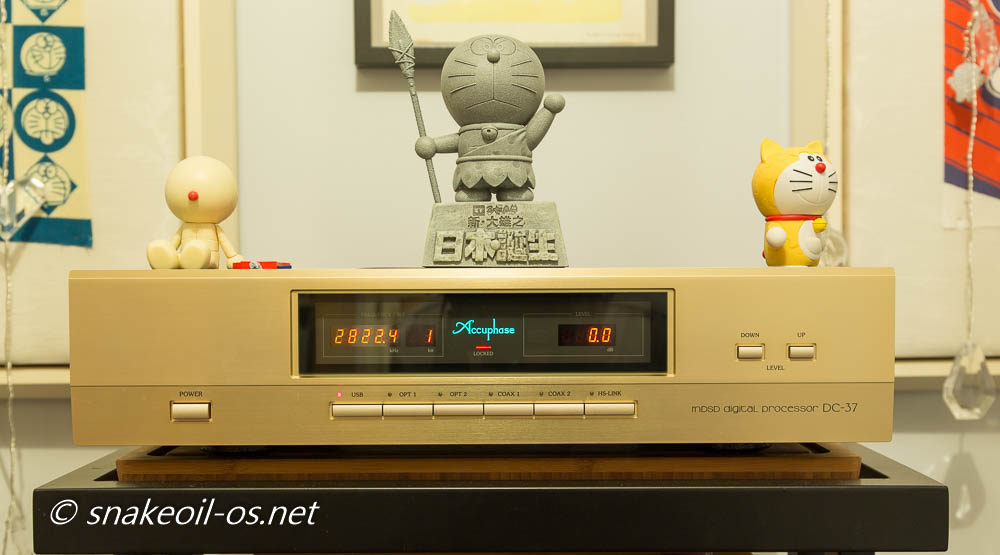
This is a classic example of an effective user interface. It adopts the classic left to right workflow. Starting from the left:
- Power on the machine
- Select your input
- Play your music, the information is displayed prominently in the middle console.
- Adjust your volume with your right hand, and your head is naturally focused on that middle console with the volume adjustment status
Most people will not even think twice or notice this as a feature - operating Accuphase products comes naturally if you are used to the "left to right" paradigm.
All the Accuphase components I have seen so far appear to follow the same workflow, e.g. with their typical CD Player, again you start from the left:
- Power on the machine
- Select the layer you want to play SACD or CD
- Eject tray with right hand, insert medium with left hand, close tray with right
- Hit play with right hand
They have enforced a ritual upon you without you even knowing it. This is the way they want you to use your equipment, and they have told you so without uttering a single syllable.
After you are used to the Accuphase approach you will find other components annoying - e.g. you'd notice controls on other components are all over the place, ill thought out and random.
The Snakeoil OS web app also uses the left to right, then top to bottom design. The difference is mine is a mess, and Accuphase nailed it.
Accuphase - it just works.
Look (Part II)
Here is a close up of the power button, with the central input selector buttons in the middle. Notice the different button sizes, the sizes force your brain to logically associate them by function and importance.

The power button, being the button that is likely to be the most frequently used, is the most beefed up button on the Accuphase front fascia. The input panels, the secondly most used controls are sized smaller, but now wider so that they are still easy to select.
Notice how the most common used inputs of the modern day (USB and HS-Link) are placed at both the right and left end, while the less common ones remain in the middle. This is by design as this allows you to intuitively select the two most popular input straightaway without barely a thought.
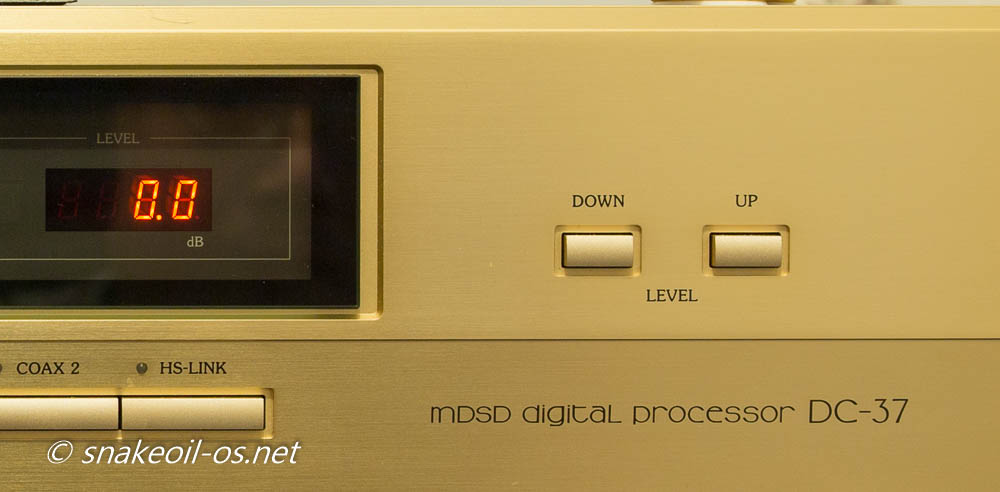
Here is the view of the volume control, notice the difference in dimensions again. Because we are now used to the left to right approach, we naturally placed more importance to things to the left hand side, and this my friends is why the Down button is before the Up button.
And here's the middle of the DC-37. Again applying the left to right philosophy, the sample rate and bit depth comes first, followed by the beautifully lit Accuphase logo in the middle with the signal lock underneath, and the volume meter on the right (0 dB means no attenuation).
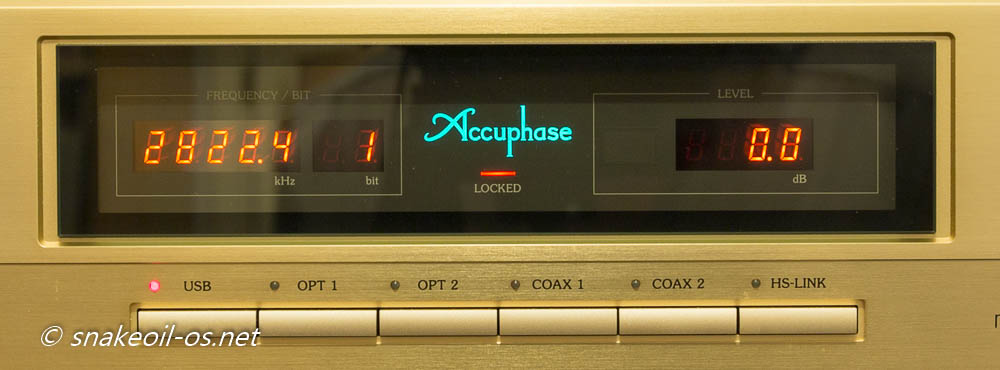
This LCD is simple with no fancy OLED or graphical gimmicks. It is not pretty hifi but it redeem itself straightaway by it's functionality. The picture is exposed a tad too long, but this LCD is very legible, unlike some of the cheaper LCDs out there, you will never misread 8 as 0 (or vice versa). Below the LCDs you'd see the unit for each measure - kHz, bit and dB respectively. Accuphase used the correct SI notation on all 3 counts. I have seen so many self styled experts on the Internet who did not even realise they have showed their hands by using terms like KHz, DB, or db. Worse to see wrongly labelled units appear on Hi fi gear!
Now here's the game changer!
Imagine placing your finger and press any of the button? Yes, the button labels are not hidden from view. Do you have hifi components with text text labelled below the buttons? Or the text has poor contrast (and even un-labelled)?
Be annoyed, be very annoyed indeed why other brands did not put the same emphasis on the user interface like Accuphase has!
The little things count, and user interface design detailed to such a level really speaks volumes about Accuphase's philosophy and approach to audio - simplicity brings excellence.
Look (Part III)
Not impressed yet that Internet experts do not know their engineering SI units but Accuphase do? Well, how about this gem, this is a screen cap of their PDF brochure.
Note the words guaranteed specs, and measured according to the JEITA standard CP-2402A. The statement is subtle, but these few words revealed just how proud they are with their products, how confident they are with their QA and QC. So much so they are happy to stand behind every product they make with a performance guarantee.
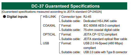
And they know what they are doing. The most important thing in measurements is reference and specifications. Measurements without these two as qualifiers are absolutely meaningless, Accuphase provided both.
How many times have you read on the Internet that "if something is different, then it is measurable"? Unfortunately these people are playing lab coat engineers. It's flawed to assume measurements is perfect. You have to back up your measurements with at least the following:
- Why you measure the quantity this way
- Is there already a industry standard for performing this measurement (There can be lots of details in this, including defining the noise threshold, the range of acceptable values, false positives, etc)
- Is the measuring instrument calibrated
- Is the measured result corrected
- Has the entire series of measures been quality checked
There are so many what ifs and gotchas involved in measuring, a statement like "if something is different, then it can be measured" is hardly a tautology.
The why is too hard to explain for now, wait for this in an Audiophile Myth post instead.
Of the Accuphase literature I have read so far, AFAIK they have crossed all the t's and dotted all the i's when it comes to the measured specifications. Obviously I cannot vouch for the accuracy of their measurements, but looking at the correctness of the paper work alone, consider me very impressed.
Personally I cannot do a better job. As a matter of fact, forget about better, I cannot match their quality of work.
You get the idea now why Internet discussion tend to go around in circles and never end. That is because the goal posts keep changing. The whole idea of science and engineering disciplines is to stop the goal posts form moving. The difference between science and pseudo science hangs by a thread. Yes I am constantly being self aware that I must not end up preaching pseudo science, so back to the review we go.
What Accuphase has done so far, is above and beyond any audiophile company that I'm aware of. This is what makes a premium brand and how it separates from the middle of the pack manufacturer out there.
Ironically the letter J in JEITA probably means Japanese, meaning I still have absolutely no clue whatsoever what the specification actually is. But honestly that do not bother me now. I had quickly glanced (bare witness?) at the English manual of their C-3850 specifications page, cannot spot any mistake. In that defining moment I realised I have morphed into the Accuphase fanboy.
LOOK (Part IV)
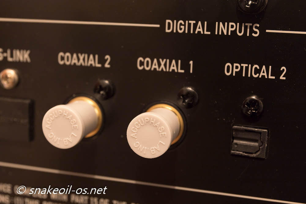
And so we end up with the back view of the DC-37. Apologies for the blurry shot but you can get a clearer picture from the Accuphase website anyway. Good to see every input has a screw nearby - acts as a reinforcement so you can use heavy gauge interconnects if you want to. This reinforcement also ensures durability of the gear for years to come.
Love the lower placement of the IEC input too. If you have a thick power cable, it will not completely block access to the gear from that side.

A while back I blogged about phase inversion, and how it can be a confusion to figure out when your unit is in 2 Hot or 3 Hot mode. Here is Accuphase's novel approach. 3 is bigger than 2, and they simply draw a larger box for 3, and a small box for 2.
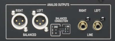
What this means is you never need to struggle at all when trying to adjust the phase (or know which direction means what). From any angle and side, simply look at the sizes of the box and know the bigger box represents 3 hot and the smaller is 2 hot. An elegant solution to a problem few even know they have.
Here is a nice Accuphase touch. Their RCA and HS-link dust caps has the words "Accuphase Lab Inc" on it
LOOK (Part V)
Japanese loves wood, the DC-37 side panels has this wood grain pattern that changes colour subtly depending on how your viewing angle (at times the sides has this ebony black shade, and it moves from that to some deep cherry red).
Here is a close up of the polished side panel with a LED torch shone for highlight (the white spots are dust). The side panels don't scream look at me, but there's a sophistication to it. And a certain degree of mystery - to be honest I'm not entirely certain if these side panels are real wood, or metal panels with a wood grain painted/printed on it.
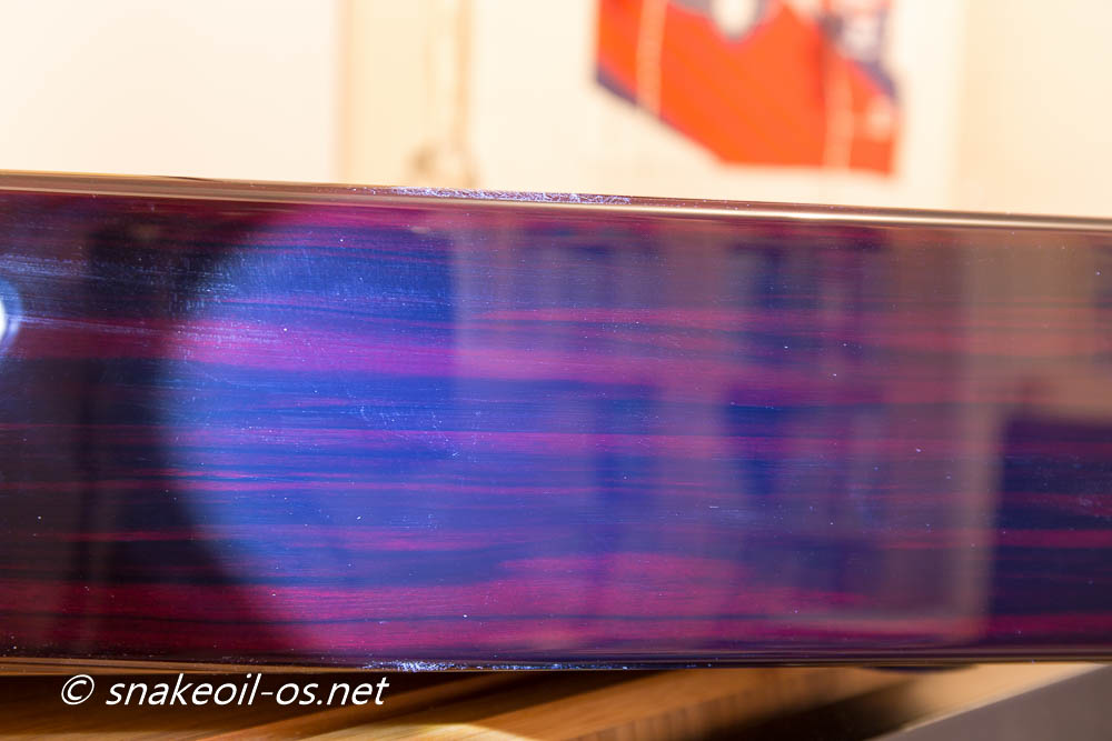
Hard to describe what these panels are made of. They look, feel and touch like wood. The precision of the machined finish suggest it is metal. For all I know these panels could well be hand crafted and not machined. Having only ever used Ikea furniture for my entire life, I am totally unqualified to identify what materials they are made of.
All I can say is they are beautiful. The panels adds a nice touch and soften the harder looks of the front.
Cool Feature
Here is the Accuphase again, but now playing back redbook material. For the uninitiated rebook means 44.1 kHz with a 16 bit depth.
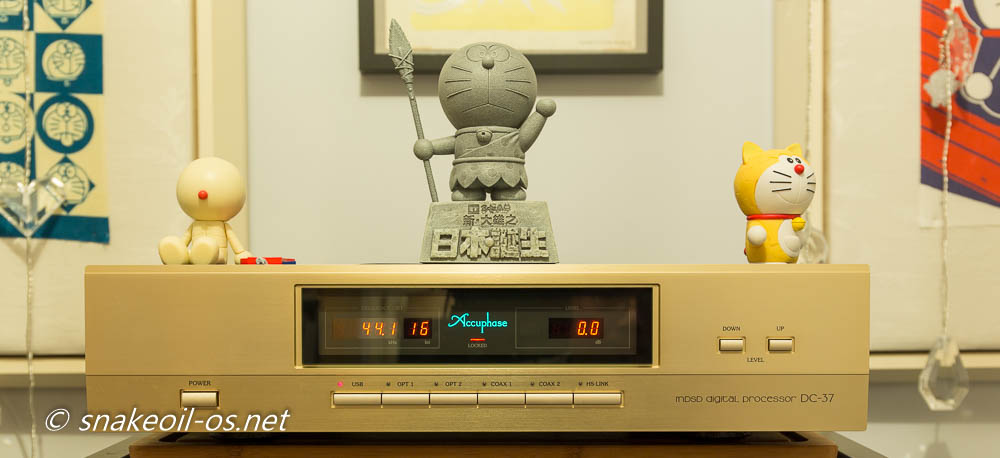
The coolest feature for me is the display LCD. I like to use that as a quick and easy diagnostics tool when doing my Snakeoil development. One of the questions I often ask myself is - is the music I am streaming bit perfect? Don't over think bit perfect for now as my motivation for this is testing the players in both bit perfect mode and modified mode.
If you are using Snakeoil OS right now as your music OS, you may have seen this in the hardware tab before. It tells you the sampling rate and bit depth of the datastream that is sent to your DAC or sound card.
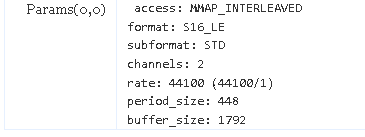
In the above example, I know the data is 44.1 kHz with a bit depth of 16 bits. But a strange thing is happening with Squeezelite, when playing music, this panel is actually telling me the bit depth is 24 bits.
The first editions of Snakeoil actually used a custom copy of Squeezelite that is modified to open the audio card with the correct bit depth, and send the data with the correct word length. I have since reverted that chance because Accuphase is telling me the data is effectively 16 bits (i.e. 16 bit data with 8 bits of blanks), and I bet they are right!
This is a video of me clumsily try and adjust the volume control on my mobile. Look at how the bit depth change over time.
Why did the bit depth increase though?
As the sound wave hits the microphone, the movement of a internal membrane is translated into voltages. A loud sound results in a bigger movement of the membrane, resulting in a higher voltage. The same is happening in reverse with softer sounds - smaller movement translates to a smaller voltage. This voltage reading (done 44100 times every second) is the basis for digital audio.
As the volume gets softer and softer, there comes a point when the small value can no longer fit into 16 bits of space (i.e. in 16 bits, even the least significant bit is now louder than the volume you want). When it passes this threshold, computer software does some clever things and extrapolate the volume into additional bits of space. By using 24 addressing it is now possible to represent that smaller number, and 32 bit space allows you go even smaller. This is why the display changes from 16 (full volume) to 24 (slightly softer volume), to 32 (very low volume), and ultimately to 0 (no volume).
And the display changes in real time, with < 1 second of latency. How cool is that huh? Do not forget this is a audiophile component we are talking about here!
Now I have something else that I can use to independently verify with what I can see from the Linux OS. If Snakeoil is my full time job, can I tax deduct the Accuphase DC-37 because it is work related?
Listening Impressions
The previous pages alone already provide plenty of reasons and justifications for the more sophisticated audiophiles to simply go out and own their very own Accuphase DC-37 (for the few lucky ones, a DC-950).

But if you are like me, being of the less sophisticated creed of audiophiles, we have to ask this question:
Just how does it sound?
This DAC is using the ESS9018 DAC chip internally after all. There are a lot of less than ideal ESS9018 implementations out there. How can the DC-37 be any different? Of course it is! It is an Accuphase after all. Why would a company put so much care and attention in user experience and documentation, and churn out a turd?
I'm very disappointed with my Marantz SA11-S2 as it fails to deliver the connection to the music when I'm listening. The same cannot be said with the DC-37, especially with DSD material. DSD never sounded this good!
A disclaimer though. I always let my emotion follow through when I listen to music, to allow the primal side of me a chance to take over. The side effect of this listening method is the brains is never engaged, and that means I hardly take notes. Listening to music this way allows my body (and soul?) to rest from the daily grime, a chance to give the brains a bit of rest and be ready for the next day.
Understandably this method don't allow for any logical audio reviews, so please excuse this while I try to work out a better solution in the future.
Listening Impressions (Part II)

| Performer: | Carolyn Chan 陳楚喬 |
| Album: | Carolyn Plays Piano Collection of Hayao Miyazaki 宮崎駿動画音樂作品集 |
| Year: | 2014 |
| Format: | DSD |
This is a very interesting album. When playing this on my Marantz SA11-S2 I skipped through the tracks and finished it in 3 minutes. Do not really know why but the interest is just not there. The reason dawned on me when playing this via the Accuphase DC-37.
The whole album is actually very beautifully recorded (Ghibli movies have beautiful music), but very dead sounding at the same time. There are next to no reverberations on any of the recorded instruments, the entire recording is very damped.
This is still a good album though, the piano is very dynamic and at times explosive; the timbre of the violin is sublime. The ensemble is in total sync with each other to a clinical precision.
As mentioned before the only pitfall for me is the sound is too clean. I can only hear the fundamental notes of the piano and other instruments and there is too little ambiance to add interest.
Your playback room plays a critical role when it comes to recordings like this - my room is too small and too heavily treated to give this album justice.
Listening Impressions (Part II)

| Performer: | Various |
| Album: | Accuphase - Special Sound Selections Volume 1 |
| Year: | 2007 |
| Format: | DSD |
There are a few stand out tracks in this album, including "II Silenzio", "Funeral March Of A Marionette", and more.
In the track "Funeral March Of A Marionette". There is a lot of background noise in the music, as if somebody is counting beats. This is something I did not notice when playing this on the Marantz before.
Do not remember much on this album. I did make some notes, but they did not make any sense to me as I write this review. Surely this is a sign this is a great album?
Listening Impressions (Part III)
| Performer: | Brentwood Duo |
| Album: | Deadpool - Reloaded |
| Year: | 2016 |
| Track: | 12 |
| Title: | Deadpool Rap (Acoustic Version) |
| Format: | CD |
Now this is something different. This is the Brentwood Duo covering the Deadpool Rap. Beautifully performed, beautifully recorded, and outrageously funny! Australians indeed have a unique sense of humour!
The DC-37 makes it effortless to discern between the male and female vocals instantly, allowing you to pin point where they are in the sound stage. Wonder if some systems will render this track as two females singing?
The CD edition appears to be different from YouTube, regardless check out their video below and have a good laugh. At least in this instance I actually prefer the you tube video over the CD. Just seeing the duo sing this sing with a straight face is enough to make me smile. Great work!
Perfection
Many CE devices allow you to upgrade the firmware to fix problems (or add new features). They tell you firmware upgrade is a feature. In fact it is just poor quality control. I know because Snakeoil OS is built around the idea of firm wares (what I can say, this is a one map operation after all).
The reality of firmware upgrade is this - we are shipping a unfinished product. We want to get your money first and you may end up with a finished product in time. In most likely hood that will never happen. In a couple of years we will try and sell you something else, something that is the same but disguised as something new.
At least I am making Snakeoil free. What excuses can the others make?
Also, many SACD players allow you to configure the low pass filter too (e.g. full pass, steep and gentle).
The Accuphase DC-37 offer none of these modern day "features". The DC-37 is sold as is, sold as a fuss free plug and play CE. Most importantly, the DC-37 is sold as a finished product.
They are confident there is no need for you to upgrade the firmware.
But alas there is a bug they missed. The DOP marker is not detected properly in some instances - if you play DSD and immediately switch to High res PCM (e.g. 192 kHz material) and vice versa, you'd get noise (Fun trivia: You can actually hear the music but they are at a very low volume). Switching to a 44.1 kHz material then to one of the high res formats fixed it.
This is the only issue I have found so far.
Other DSD DACs from the same era suffers:
- Fear inducing loud pops when switching between different formats, you can hear the Accuphase cleverly attenuate the sound before full volume is restored
- High frequency noises not completely filtered out
- Random freezes or reboots
- Need to power cycle the unit multiple times to work
- Need to power cycle the unit when playing different formats
- No audio
Accuphase only has this single playback bug, with a very simple workaround.
This one bug tells me that the people working in Accuphase is only human after all. And it is this single bug that makes me love Accuphase the brand even more. They are not perfect, but they are trying damn hard at it. What is their motivation, what drives them to this level?
Note: This DC-37 unit is one of the first DC-37s ever sold. In all likelihood the later DC-37s and the new DC-950 do not even have this issue.
Conclusion
Having used the Accuphase DC-37 for a while now, these are the only two short comings I noticed:
- Yet to succeed in rendering voices to a ghostly/realistic level the KillerDAC can do
- Timbre is just slightly off to the KillerDAC, with a slight hint of digital edge at times when playing redbook
And I'm really picking the bones and being very fussy here. The gains on the other hand far outweigh the two things above:
- More definition in the lower end. Bass is the soul of music and the DC-37 can do this in spades (even out my tiny ML-1 Ultras)
- Very good speed and pace. It is this attribute that allow me finally realise the issue that was bugging me with the Carolyn Chan SACD
- Very low noise. As good as the KillerDAC is, the noise floor is too high with very limited dynamic range. I'm happy to get the full dynamic range of my stereo back again
- The timbre and realism is second only to the KillerDAC, and IMO is streets ahead all the other DACs I have experienced so far
This DC-37 is capable of playing music to hold my attention and yet allow my imagination to run wild at the same time. For me playing back redbook so far does not have the same magic as HighRes/PCM. I'm confident this is a setup issue and will continue to investigate this further (anybody has a unused PCI SOTM card and want to donate to the Snakeoil project?)
Pros
- Solidly built with thought placed into everything
- Legible LCD with active realtime bit depth information
- Solid Redbook player
- Excellent High Res PCM and DSD player
Cons
- Problem when switching from DSD to other high res PCM files in a playlist
- USB input easily damaged. Do not power the USB card externally just in case. *NEW*
Certainly impressive considering this unit is based around the ESS9018 chip set. True to the word it's the implementation and not the the DAC chip that makes or break an audio component.
In Japanese culture there is this unwritten law on the strive on perfection. You see this law every day in Japan, every thing they do they are striving for perfection. I see this in their food (ramen, sushi), I see this in their wares (knives), and I see this especially in their gardens.
And now I see the same in the Accuphase DC-37.
For what this DAC can do, the RRP of the DC-37 suddenly appears very reasonable, and if one ends up on the second hand market, IMO it is a crime of audiophilic proportions to if you did not buy one if the opportunity arises.
Review Gear
This review is written based on the following gear:
- Marantz SC-11S1 pre-amplifier
- Marantz SM-11S1 power amplifier
- Furutech GT-2 USB
- Accuphase DC-37
- Jetway NF9C running Snakeoil OS (v1.4.0 with Squeezlite 1.64 only)
- JS2 power supply with Hashimoto Choke, Hashimoto Transformer and Jensen caps
- Kimber SilverStreak XLR (Pre to power)
- Achtung silver XLR (DC-37 to Pre)
- PSAudio P5 (Furutech fuse)
- ClearAudio Diamond power cables
- Sine world GPO
[Update: 24 Feb 2017] And my USB input is not responding. Can't use the USB input now for playback, will have to troubleshoot this down the stretch! :(
[Update: 28 Nov 2017] And my USB input is fixed. If you have a DC-37 it's important you read this: Read More.


Add new comment