How To Fix Network Layout in Untangle Dashboard
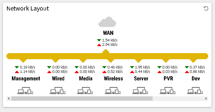
Untangle is a software network firewall/router/security appliance solution that gives you insight of your home network traffic right out the box (Compared to say pfSense). However, there is a quirk, a horizontal scrollbar will appear if you have too many network interfaces. This is a problem as the number of detected clients per network are now hidden by the horizontal scrollbar, like so:

There is a simple way to fix this, and that means modifying a single CSS file. Read on to find out more.
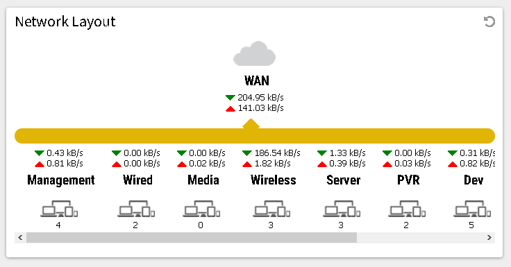
The fix is simple - just move the contents of the local area network up. This will cover some of the arrows, but in my opinion it just makes the whole network layout looks neater. Like so:

Moving up the entire contents is is ugly, but it works, and it only involves a single byte change. Here's the style in question:

Change the "margin-top" attribute from "10px" to "00px" will make the number of clients visible again. The CSS file to modify is /usr/share/untangle/web/admin/styles/ung-all.css. Make the change, force a reload and all is good.
If you want, you can modify all the objects and realign everything to make it even neater. Personally I find the above good enough as it only involves a 1 byte change.


Add new comment